Monday, March 31, 2014

Flow Map

http://scitechdaily.com/how-airports-will-influence-the-spread-of-a-contagious-disease/

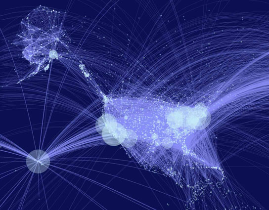
Flow maps are developed in cartography to show linear movement from one location to another with the width of the flow line increasing or decreasing depending on quantity. The flow map above shows the flight routs from the 40 largest U.S. airports. This type of map can be extremely helpful in determining links to how things spread, such as disease, and determining the place of origin.

Range Graded Proportional Circle Map

http://visuanalyze.wordpress.com/

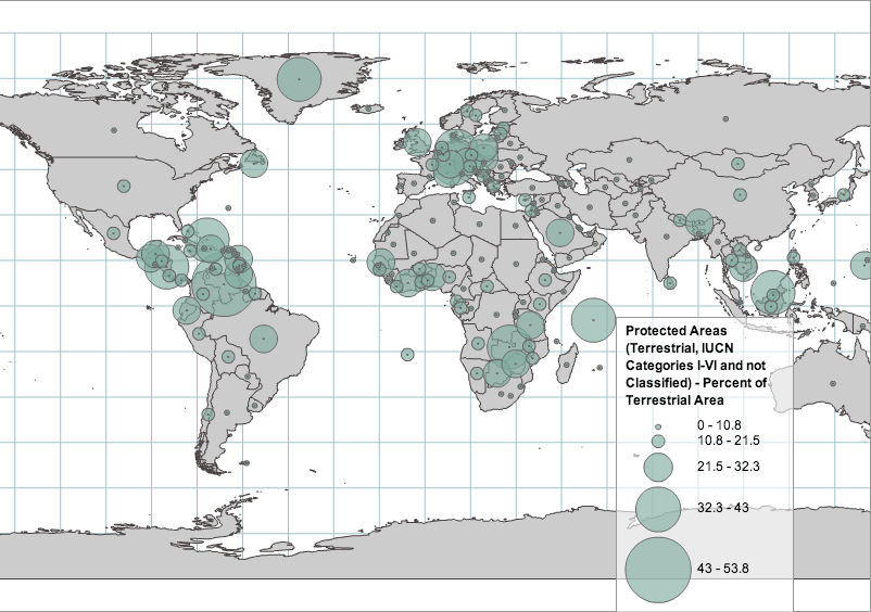
A proportional circle map is a type of point pattern map. In a proportional circle map the size of the circle or symbol is dependent directly upon the measured variable. There are two different types of proportional circle maps, range graded and continuously variable. Range graded proportional circle maps have a set of circles listed in the legend and the data must fit into one of the circles used in the legend. The map above shows the percent of protected terrestrial areas around the world. These areas range from 0% protected - 53.8% protected. Every protected area in this map falls into one of the proportional circles categories, they do not vary in size from those that are used in the legend.

Dot Distribution Map

http://www.nrcs.usda.gov/wps/portal/nrcs/detail/national/technical/nra/nri/?cid=stelprdb1083124

Dot density is a type of point pattern map that uses non-proportional points to show the density of the measured data. The dot density map above if showing the amount of rangeland there was throughout the United States in 2007. One dot on this map represents 25,000 acres of rangeland. As you can see the distribution of dots (acres of rangeland) is very dense in the western United States, but very sparse in the east. Dot density distribution maps can be very beneficial when trying to determine the density of a specific type of place, object, or species. 

Sunday, February 23, 2014

Isohyet Map


An isohyet map is a type of contour map that uses isohyet lines to portray equal points of precipitation in a given period. This map is great for showing the amount of rainfall in a given area on a two-dimensional surface. The isohyet map above was generated to show the daily rainfall status on May 5, 2012 for Malaysia Peninsula. The isohyets indicate the amount of rainfall from 0-900 millimeters for that date in the Malaysia Peninsula. The areas in white received no rainfall on that date while the areas in darker green received up to as much as 25 mm of rainfall. The area that received the most amount of rainfall at 50 mm is shown in the darkest green. Isohyet maps can be helpful in retrieving and maintaining accurate records of daily rainfall overtime.    

Hypsometric Map

http://hydrosciences.colorado.edu/symposium/abstract_details_archive.php?abstract_id=92

The basic concept of a hypsometric map, like the one shown above, is a surface map that exhibits relief. The third dimension of relief can be shown by color and shaping, contour lines, and raised relief. For most part the third dimension shown in a hypsometric map is topography relief, but there are instances where the map is instead describing a phenomena or process that's being superimposed on the surface. The hypsometric map above represents the the elevation in meters from 0-8000 in 1000 meter bands of the Budhi Gandaki basin. This hypsometric map uses raised relief as well as color and shaping to convey the third dimension of topography.


Cartogram

http://www.viewsoftheworld.net/data/PaullHennig_2011_EJSS_OrganicAgriculture.pdf

A cartogram communicates relative distance scaling among places in regards to their similarity of a particular attribute rather than measuring by physical proximity. The map above is an equal-density cartogram displaying the density of organic agriculture worldwide. The distribution of organic agriculture is clearly uneven across the world. Illustrated here, Australia has expanded to be multiple times the size of the physical land mass meaning that it's the most common user of organic agriculture per hectare. North America on the other hand looks very similar to it's physical land mass, not appearing bloated at all, showing that organic agriculture per hectare is not the dominate practice within North America. The distance between the the map areas is not absolute but rather relative to the position of the area in its number of organic agriculture hectares.