Thursday, April 17, 2014

Bathymetric Map

http://celebrating200years.noaa.gov/events/survey/gulf_of_mexico.html

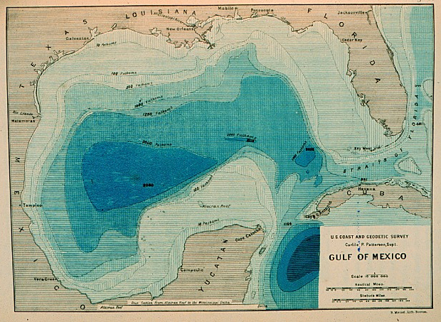
Bathymetric maps use contour lines to create detailed topographic images of the sea floor.The end result of this process is to be able to clearly depict the size, shape, location, and density of underwater features. The bathymetric map is a key resource tool in the development of energy and marine resources. The bathymetric map above was the first of its kind to map a realistic ocean basin. The surveys taken to develop this bathymetric map were done in the late 1800s in the Gulf of Mexico. You can tell by the range of colors that the darker the blue is on the map the deeper the ocean is in real life.


Social Network Map

http://ucsdnews.ucsd.edu/archive/newsrel/soc/07-07ObesityIK-.asp

A social network map connects individuals through a common variable. Each circle on the social network map above is a representation of one individual, the size of their circle indicates Body Mass Index, and the lines are drawn for family and friendship ties. This social network map is based on a population of 2,200 and according to the data drawn if people who you are connected to by friendship or family ties that are obese or become obese increase your likelihood of becoming obese. The percentages vary depending on the type of connection.


Bivariate Choropleth Map

http://www.cdc.gov/dhdsp/maps/gisx/mapgallery/textonly.html

A Bivariate Choropleth map uses a single map to convey the data from two different variables for a given geographic area. In order to distinguish between the two variables different symbols or colors are used to depict each set of data. The example above is a bivariate choropleth map of Illinois from 2006-2010 describing rates of colorectal cancer and mortality rates. The different shades of blue on the graph represent the age-adjusted incidence rates and the circles of varying sizes are used to show the age-adjusted mortality rates per 100,000 population. As you can see from the graph, areas where incidence rates are low (in light blue) are also areas where mortality rates are low.

Triangular Plot


https://www.uwgb.edu/dutchs/Petrology/classification_of_igneous_rocks.htm

A triangular plot compares the similar and different aspects of three variables along an equilateral triangle which sum to a constant. the triangular plot above depicts the relationship between the ultramafic rocks with relative amounts of Olivine, Hornblende, and Pyroxene. If the rock is made up of more than 90% of any variable then it is classified as Dunite, Hornblendite, or Pyroxenite. This graph can serve a great purpose when attempting to determine the amount needed from each variable to create a particular final product.  

Wednesday, April 16, 2014

Bilateral Graph

http://www2.warwick.ac.uk/study/cll/open_courses/certs-1314/ecology/students/autumn-term/week-5/

Bilateral Graphs are created to show the overlap or intersection of two corresponding variables. The Janzen-Connell hypothesis describes the relationship between seed distribution and seed survival. As you can see from the graph as distance increases from parent tree the probability of seed distribution decreases but chances of seed and seedling survival increases. The two variables intersect at a certain distance which is the optimal area for the distribution of seeds with the highest chance or survival. This diagram is used in biogeography to illustrate why tropical forests are so diverse. In the tropical forests there are a lot of seed predators so parent trees are required to distribute their seeds further to help ensure survival. This is a check and balance relationship that creates great species diversity in the tropical forests. Bilateral graphs, such as this one can be very beneficial in comparing the relationship of two related variables.


Tuesday, April 15, 2014

Isoline Map


Isolines or contour lines are used to create Isoline Maps. Isoline maps are also topographic maps that join points of equal value that are being measured. Isolines allow the cartographer to convey three dimensional data onto a two dimensional surface. On isoline maps when the area between the isolines is very narrow that indicates a large increase in the third dimensional variable over an extremely short distance. This is the opposite when there is a wide gap between the isolines. The isoline map shown above features the Bright Angel Trail in the Grand Canyon National Park. As you can see from the map there are different rates of descent in elevation during the course of the 9.5 mile hike. In areas of greater change within a short distance the isolines are closer together while in areas where the hike is more of a leisurely walk the elevation does not change as rapidly and the isolines are further apart.  


Aboriginal Songline


http://ippha.anu.edu.au/songlines-western-desert

Aboriginal Songlines are maps that route the history of indigenous beings across much of Australia. The songlines tell of the landscapes they encountered, the animals they hunter, and the food that was gathered. The songline presented above is a map containing all of Australia and the route that was traveled directly through the middle of the continent by Aboriginal peoples. The Aboriginal songlines are a cultural, spiritual, and beautiful way of mapping our journeys. 

Digital Line Graph (DLG)


Digital Line Graphs (DLG) are digital vector representations that combine features of the planimetric and  topographic map to present data as points, lines, and areas. These graphs incorporate an array of categories such as political boundaries, transportation data, utility lines, vegetative surface cover, etc. The DLG shown above is the state of Illinois in 2002 using transportation available for sale and transportation in progress as its feature layers shaded in grey.


Sunday, April 13, 2014

Classed Choropleth Map

Percentage of Individuals Living in Poverty by county


http://www.cdc.gov/pcd/issues/2007/oct/07_0091.htm

In classed choropleth maps different colors or shadings are used to depict the set of data classes. This classed choropleth map is showing the percentage of individuals living in poverty by county within the United States.  The color range chosen to represent the percentage of individuals in poverty per county varies from the least amount of individuals with a light yellow to the largest percentage with a dark red. There are many methods to choose from when it comes to dividing the data, the method that was used for this particular graph was quantiles. This method divides the number of data values evenly into the classes, this is why the colors are distributed evenly throughout the map.

Continuously Graded Proportional Circle Map

http://www.texastribune.org/2011/04/11/texas-agency-battled-2600-fires-since-2009/

Proportional circle maps are a type of thematic map that us proportional circles to link a theme to a geographic location. Proportional circle maps can either be range graded or continuously graded. Continuously graded proportional circles maps such as the one seen above convey data through the use of all sizes of proportional circles. The graph above is a depiction of the homes in Texas that have been lost due to fire from 2009-2011 according to the Texas Forest Service. The large the circle shown on the map the more homes that were lost due to fire. There is a legend displaying what a circle looks like if 1, 10, or 100 homes were lost to help viewers gauge the amount of homes by comparing the size of the circle of interest to those in the legend. As you can see there is a lot more variation in the size of proportional circles than just the three shown on the legend, because of this aspect the graph is a continuously ranged proportional circle map.


Friday, April 11, 2014

Unstandardized Choropleth Map

http://www.ilsr.org/retail-maps-graphs/

This is an unstandardized choropleth map showing the number of persons per Walmart store in 2007. The amount of people for that year ranged from 0-221,911. The graph does not account for the size of the states or for the amount of Walmart stores within the states.This is considered to be an unstandardized choropleth map because the data is not areally averaged by either density or percentage.

Thursday, April 10, 2014

Standardized Choropleth Map

http://www.agcensus.usda.gov/Publications/2002/Other_Analysis/

In a standardized map such as the one above, the numerical values are areally averaged by density or percentages. This standardized choropleth map is showing the population of principal farm operators ages 65 years and over in counties and how they are relative as a percent to the total number of principal farmer operators ages 65 years and over. The pattern shown on this map would change drastically if the numerical values were not averaged.

Ordinal Data Map

http://vmrhudson.org/socic.html

Ordinal data maps like the one above are ranked into groups using qualitative rather than quantitative units. This ordinal data map ranks states of concern to the international community from "has almost never violated economic or political norms and has not violated use-of-force norms" to "has frequently and egregiously violated use-of-force norms and economic/or political norms" by using a range of colors depending on the severity of concern for the state. The data for this map is ranked according to relative measures without the inclusion of numerical data.

Nominal Data Map

https://www.uwgb.edu/dutchs/EarthSC202Notes/rockcycl.htm

Nominal data maps do not have a set ordering for the groups and show only qualitative data. This is a nominal data map of the different types of soils throughout the United States shown in a range of colors. The soils are not placed in a set order but are only there to represent the variation of soils throughout the United States.

Wednesday, April 9, 2014

Propaganda Map


http://www.bl.uk/collection-items/propaganda-map-war-national-industry-prussia

Political Propaganda maps come in very handy when a cartographer is trying to stir up the pot. This type of map is used frequently to emphasize threat, enhance support, or entice border disputes and have played a key role politics throughout history. As the saying goes a picture tells a thousand words and the political propaganda map above is telling the story of the eminent danger that Prussia presented in Europe and how the French were fighting to seek freedom for it's territories that had been given to the Germans 40 years prior. The map was generated in 1917 with the image of an octopus lingering over the French territories and creating an appearance that Prussia would use their expanding tentacles to spread over Europe.  


Cartographic Animation

http://climvis.org/content/global.htm

The production of Cartographic Animation would have never been made available without the major technological advancements of the 1990s. The advancements in technology allowed two dimensional and three dimensional imagery to communicate atmospheric phenomena through in-time visualization. Cartographic animation allows the viewer to watch distinct changes in the atmosphere over time as well as help recognize trends or patterns. The cartographic animation shown above is a representation of the global seasonal temperature variations from 1971-2000.  Judging from the graph temperatures decrease as latitude increases. The temperatures during that period range from -40C to 30C with the tropics on the higher end of that spectrum and polar regions on the lower end.


PLSS

http://nationalatlas.gov/articles/boundaries/a_plss.html

The Public Land Survey System (PLSS) is a systematic land partitioning system. This type of system is used to facilitate ownership. To help determine ownership a base line, prime meridian, and initial point are added to the grid. The PLSS map above was an early survey of Ohio, this looks a little different than modern PLSS but there is still a base line, prime meridian, initial point, and a clear division of ownership.

Cadasteral Map

http://edtech2.boisestate.edu/lockwoodm/Imperialism/scramble_for_africa.htm

Cadasteral maps are created to show land ownership. Borders indicating ownership may be natural features that are agreed upon by the people of the region, but they could also be boundaries imposed onto a region through the use of imaginary lines. The land partitioning that took place in Africa during the 1800s was imposed on the indigenous peoples by European nations carving previously inhabited areas into colonial boundaries. Tribes were ripped apart because the previous natural boundaries were no longer relevant. Creating a cadasteral map is essential for determining boundaries, without the necessary visuals to support their claims no one would ever be able to define their territory resulting in constant unwanted changes.


Tuesday, April 8, 2014

Mental Map

http://blog.education.nationalgeographic.com/2012/02/17/five_for_friday_mental_maps_and_the_world/

Cognitive or mental maps are abstract views of reality. Typically mental maps are real world locations based on an individuals personal perspective. This type of mapping was first displayed by early humans who drew identifying markings on cave walls. The map above is a mental map of a Texan's view of the United States. To this individual Texas is overwhelmingly larger than the rest of the states in the country. This mental map also implies that Texas is the "meat and potatoes" (the best part) of the country. Though this may be true in the mind of a Texan, the rest of the world can see that the actual state sizes are much more proportional to one another than depicted in this map.

Thematic Map

http://docs.autodesk.com/MAP/2011/ENU/AutoCAD%20Map%203D%202011%20Help/Map3D_2011_HTML_Help/filesBestPracticesForGeoData/WS73099cc142f48755-575eab4c124f5234aa8-34ba.htm

Thematic maps are commonly used to link a specific theme to a geographic area. Thematic maps can come in many forms including: dot distribution maps, choropleth maps, proportional circle maps, and isoline maps. Choropleth thematic maps, like the one presented above, are used to show the distribution of a topic (in this case literacy rates) based upon boundary lines (districts).The thematic maps above were generated to reveal the female, male, and total literacy rates in India by district for the year of 2001. As you can see by comparing the differences in color distribution for the series of maps literacy rates are much higher among men than women in India for that year. 


Doppler Radar

http://www.srh.noaa.gov/mlb/?n=charley

Doppler radar releases microwave radiation through the use of a transmitter in order to route the direction and speed of water in the atmosphere. A directional antenna is placed on the Doppler Radar to gather information such as the time that reflected pulses of microwave radiation arrived from distant objects to measure and track their motion. This type of radar is great for severe weather such as tornadoes, which has increased the warning time dramatically in recent years. The image above is the Doppler Radar for Melbourne, FL on August 13, 2004 as Hurricane Charley crosses over the area. As you can see from the image this is severe weather moving at a high rate of speed.


LIDAR


LIDAR (light Detection and Ranging) creates vivid images of the earth's surface through the use of pulsed lasers. This type of remote sensing focuses on light to measure distances to the Earth. The image generated by LIDAR is three-dimensional and extremely detailed. LIDAR is incredibly useful for shoreline mapping, generating data for emergency response, storm surge modeling, etc. The LIDAR image above was collected over Bixby Bridge in Big Sur, California. This is a three-dimensional image projected of the bridge from an upward view as well as a profile view. This image, along with many others generated by LIDAR, was taken to examine the man made environment of the bridge.  


Monday, April 7, 2014

Infrared Aerial Photo

http://www.nps.gov/hosp/planyourvisit/canyon-trail.htm

Infrared Aerial photographs are a type of remotely-sensed maps that are especially sensitive to the infrared spectrum. These photographs are taken in the air by either airplane or satellite. When using infrared aerial photography objects will become easier to detect and identify, in comparison with seeing the view through the human eye which is not sensitive to the infrared spectrum. This process is advantageous when trying to distinguish between multiple vegetation types as well as land and water. The infrared aerial photograph above is a photo of the Canyon Trail in Hot Springs National Park in Arkansas. You can clearly distinguish where the trail is from the rest of the photograph as well as the vegetation using infrared technology.

.


Black & white aerial photo

http://online.redwoods.edu/instruct/colloquium/0607/

Black and White aerial photos are a type of remotely-sensed map typically taken by either satellite or airplane. Aerial photos taken in black and white are sensitive to the visible spectrum, much like the human eye. Presented above is a black and white aerial photo taken in 1952 of the Balloon Track Site which at the time was an operating rail yard. The contrasting shades of grey help to emphasize the muck and gravel mess created by rail yard industry in the center of the photograph.


Isobar

http://www.stuff.co.nz/the-press/news/your-weather/4139100/Rug-up-as-storm-approaches

Isobar maps use isobar contour lines in order to show air pressure in a geographic location at that given time.  The isobar line connects equal points of air pressure on the map. The isobar map above was released on September 17, 2010 in New Zealand to warn its inhabitants of the approaching severe weather. Winds during this westerly flowing storm were expected to reach between 120-130 kmh and had the potential to lift roofs off of houses! Isobaric maps like the one above a very important when it comes to explaining our weather and helping prepare for severe weather. 

Isopach

http://pubs.usgs.gov/fs/fs115-99/fs115-99.html

Contour maps come in all shapes, sizes, and types. The isopach map is one of those types. The isopach map uses isopach lines to show either rock or sediment thickness. These maps are beneficial when in search of an aquifer or gem mine. The map shown above captures the thickness of the Pittsburgh Coal bed in 1997. Judging from the graph, which uses isopach lines by thickness of feet, the thickest area of the Pittsburgh Coal bed looks to be about 9 or 10 feet and crosses over multiple counties.


Sunday, April 6, 2014

Isotach

http://www.hpc.ncep.noaa.gov/research/mcs_web_test_test_files/Page1947.htm

An Isotach map is a type of contour map that uses lines to illustrate wind speed in a given area. The Isotach map above from October 2006 shows strong winds heading east across Texas and into Arkansas and Louisiana. The Isotach lines are bending with wind speed and direction.

Topographic Map

http://www.americansouthwest.net/utah/grand_staircase_escalante/escalante-river-map.html

Topographic maps help cartographers reveal areas of elevation and the terrain of the land on a two-dimensional surface. This process is done through the use of contour lines that connect points that are equal in elevation. The topographic map shown above illustrates the elevation and terrain of the Escalante River trail, Grand Staircase at the Escalante National Monument in Utah. As you can see from the map the trail is along the Escalante River and there is only a slight 100 ft change in elevation along the trail. This type of map can serve a great purpose for hikers, engineers, and others who rely on the knowledge of elevation levels to complete tasks.  


Planimetric Map

http://sydney.edu.au/medicine/nepean/about/maps.php

A Planimetric map can be simply put as a surface map with no added relief features. This type of map conveys two dimensional information and is the type of map you would see on a GPS system. The planimetric map shown above is a street map focused on the location of the Sydney Medical School at the Nepean Hospital. As you can see this is a two dimensional portrayal of the area with no relief shown, it is simply streets. The planimetric is the most helpful when someone is  in need of directions and nothing else.


Wind Rose

http://snr.unl.edu/data/climate/wind.asp

A Wind Rose is a type of circular plot that exhibits the prevalence of wind directions at a given location. The Wind Rose displayed above was generated from data collected at a station in Alliance, Nebraska from 1996-2005. The wind speed ranges from 0 mph to above 20 mph from 0% - 15% of the time. In this example the strongest winds occurred in the west blowing at a rate of 20 plus mph  for about 13% of the time. This type of graph can be very useful in determining typical wind speed and direction for a location.


Climograph

Climograph for Prescott, Arizona

http://cals.arizona.edu/watershedsteward/resources/module/Climate/climate-trends_pg8.htm

To determine the climate of a region one must study the relationship between temperature and precipitation. Climograph's plot this relationship at monthly intervals over the course of a years time. The climograph above represents the data collected from Prescott, Arizona with precipitation measured in inches and temperature in Fahrenheit. This climograph uses a red line graph in combination with a blue bar graph to show the data collected from Prescott, Arizona. The highest temperature for the year was 73 F in the month of July and the greatest amount of precipitation was recorded in the month of August at 3.5 inches.  


Similarity Matrix

http://spie.org/x48704.xml?pf=true&ArticleID=x48704

A similarity matrix is a perfect tool to use when comparing the similarity between several data points. Each square within the matrix shows the relationship between two of the data points. This similarity matrix depicts the changes that occur to the motion of tumor cells in response to drug administration. As you can see from the diagram there is a diagonal form that shows groups with similar responses.


Star Plot


http://alumni.media.mit.edu/~tpminka/courses/36-350.2001/lectures/day38/

Star plots are a type of geovisualization that enable someone to compare multivariate data using variables and observations. Each star portrays a single observation. The variables that are being compared are plotted on the radii which displays each ones distinct characteristics. The length of the radii is proportional to the intensity of the variable for that data point compared with the maximum intensity of the variable across all of the data points. Star plots are often used to determine which observations are the most similar or if there are any irrelevant observations. The more correlated the variables are the closer they are together on the star plot.The plot above incorporates the star plots of 5 types of cars starting from 1, midsize, luxury, minivan, sporty, and compact. The 10 variables used for this star plot consist of: horse power, passengers, wheel base, MPG highway, width, weight, engine size, turn circle, length, and price.  From reading the star plot we are able to deduce that compact car (#5) can fit a few but not too many passengers and has great gas mileage but is not up to par with the rest of the vehicle types in every other category. Star plots would be very useful in comparing these variables while out car shopping.


Saturday, April 5, 2014

Parallel Coordinate Plot

http://www.sci.utah.edu/~kpotter/Library/Papers/ge:2009:EUPC/

A parallel coordinate plot uses a vertical axis to plot the variables within a set or sets of data. Each set of data is plotted with connected points, with one on each axis. A parallel coordinate plot can be beneficial when attempting to apply and analyze multidimensional graphical data. The plot above uses this technique "highlight the distribution of probability values of different land cover types for each pixel, and also reflect the status of pixels with different degrees of uncertainty." The data collected in the Yellow River Delta, Shandong Province, China from different types of land cover include bare ground, bottomland, urban, agriculture 1 and 2, and water.

Histogram

http://www.ec.gc.ca/mbc-com/default.asp?lang=En&n=DEE0C80B-1

A histogram like the graph shown above presents the frequency of occurrence within a set of data.  This histogram displays the number of Greater Snow Geese at Cap Tourmente NWA for the fall of 2013. The dates range from September 13 - October 31 and number of birds seen per day varies from a little more than 5500 - a little more than 55,000. You can assess from the graph there is an extreme variation in the frequency of birds at this location over such a short period of time.

Box Plot

http://weatherstories.ssec.wisc.edu/stories/armistice_day/climate.html

A box plot or a box and whisker diagram like the one shown above summarizes the distribution of a set of data using the median, minimum extreme, maximum extreme, and quartiles. The box plot comes in very handy when needing to compare multiple sets of data. The graph above is depicting the daily mean temperature in degrees Fahrenheit (F) for the month of November 1940, in Madison, Wisconsin. By using the box plot to display the data it is easy to gather the data off of the graph. The minimum extreme temperature for the month was a chilling 13 F, 23 F for quartile 1, 44 F for quartile 3, a median of 35.5 F, and a maximum temperature of 55 F. 

Stem and Leaf Plot


The stem-and-leaf plot splits the data value into two categories, the stem for the first digit and the leaf for the last. These types of plots are frequently used for calculating averages for test results. The stem-and-leaf plot shown above is used in determining the age range for attendance at a family reunion. The ages start at 1 and go all the way up to 81. There is an eighty year difference between the age of the youngest attendee and the oldest. There is not a certain age that attended more than the others. the ages were scattered. 

Scatter Plot


Scatter Plots, like the one featured above are used to show the relationship between two variables. If the value of one variable increases, then so does the other this means that there is a positive relationship between the two variables. But if the value of one variable increases, then the other decreases then there is a negative relationship between the two variables. The trend line  helps to show the relationship of the data. How closely the data fits to the trend line shows the strength of the relationship between the variables. The scatter plot above is comparing the relationship of household incoming during childhood to income during adulthood. The graph indicates that there is a positive relationship between the two variables, but because the data does not fit closely along the trend line. So if your household income was higher during childhood, than you are more likely but not guaranteed to have a higher income in adulthood. 


Population Pyramid

http://maps.unomaha.edu/Peterson/geog1000/Notes/Notes_Exam1/Population.html

Population pyramids are used to show age and sex distributions pertaining to a given region. The graphs above represent the age and sex distribution of France and India. This graph shows that in India that there are more 0-5 year old children of both sexes than any other age in the country and as age increase the percent of both sexes declines. The region of France is quite different, the population of both sexes are fairly even from ages 0-35 and then the population of both sexes slowly decreases. This graph also shows that the inhabitants of France tend to live to be much older (above 85) than the people living in India who on average die before reaching 70.


Thursday, April 3, 2014

Index Value Plot

http://www.muhlenkamp.com/investment/principles/whats_the_new_normal_economics_rules_markets

An index value plot is a type of geovisualization that portrays geographic information on a plot rather than a map. Index value plots are used to show variations from the normal standard over time. The index value plot above is representing the variation of expanding and contracting companies from the normal index value of 50 from 1997-2009. This plot is able to clearly depict the ups and downs of our economy which can be very useful in determining recession conditions.

Accumulation Plot (Lorenz Curve)

http://www.caida.org/research/policy/geopolitical/bgp2country/ipv6.xml

The accumulation plot also know as Lorenz Curve is a type of geovisualization. This geovisualization plot is used to organize and display geographic information. In an accumulation plot there is a straight diagonal line such as the purple one in the plot above that represents how the data would be graphed if the distribution (in this case of GDP and IP addresses) was equal. The black (GDP), red (IPv6), and blue (IPv4) lines are the Lorenz Curves that portray the actual distribution. Because of the inequality of distribution the plot is showing a downward bending for each of the Lorenz Curves. As the distribution becomes more unequal the larger the bend in the line becomes. This plot shows that GDP is the most equally distributed resource across the percentage of population for these countries while IPv4 is the least equally distributed resource.


Tuesday, April 1, 2014

DOQQ

http://www.tceq.texas.gov/gis/doqtnrcc.html

 Digital Orthographic Quarter-Quads (DOQQ) use a mixture of aerial images and map qualities to georeference and orthorectify basic areal photographs into useful flat maps. In standard areal photographs ground features are distorted, but through the process of orthorecitifcation those features are shown in their true position. Digital Orthographic Quarter-Quads help improve many qualities of basic aerial photographs such as accurate measurement of distance, areas, angles, and positions. The image above is a Digital Orthographic Quarter-Quad of the Texas Longhorns football stadium and the area surrounding the stadium. This photo accurately displays the stadium and its surrounding area without omitting or generalizing key features.


Digital Raster Graphics (DRG)

http://egsc.usgs.gov/isb//pubs/factsheets/fs08801.html

Digital Raster Graphics (DRG) is an image from the United States Geological Survey of a standard topographic map that has been scanned to digital raster format. The DRG above is a part of the Washington West, D.C.. This image was generated from a USGS topographic map of Washington West, D.C. and georeferenced to ground coordinates on the surface of the earth.

Digital Elevation Model (DEM)

http://ccma.nos.noaa.gov/products/biogeography/mapping/dems/

Digital Elevation Models (DEM) are used to create three-dimensional or colorized pictures to show relief. This cartographic information is gathered from the United States Geologic Survey and produced into digital format in a cell or pixel. All DEM's converted to a coordinate system, a datum, and a map projection. The image above is a Digital Elevation Model of the main eight islands of Hawaii using cartographic information derived from USGS 7.5' Quads with cell size for the DEM's at 10 meters. The variations in elevation for the eight islands of Hawaii are depicting so clearly in this image because of the use of the DEM.


Monday, March 31, 2014

Flow Map

http://scitechdaily.com/how-airports-will-influence-the-spread-of-a-contagious-disease/

Flow maps are developed in cartography to show linear movement from one location to another with the width of the flow line increasing or decreasing depending on quantity. The flow map above shows the flight routs from the 40 largest U.S. airports. This type of map can be extremely helpful in determining links to how things spread, such as disease, and determining the place of origin.

Range Graded Proportional Circle Map

http://visuanalyze.wordpress.com/

A proportional circle map is a type of point pattern map. In a proportional circle map the size of the circle or symbol is dependent directly upon the measured variable. There are two different types of proportional circle maps, range graded and continuously variable. Range graded proportional circle maps have a set of circles listed in the legend and the data must fit into one of the circles used in the legend. The map above shows the percent of protected terrestrial areas around the world. These areas range from 0% protected - 53.8% protected. Every protected area in this map falls into one of the proportional circles categories, they do not vary in size from those that are used in the legend.

Dot Distribution Map

http://www.nrcs.usda.gov/wps/portal/nrcs/detail/national/technical/nra/nri/?cid=stelprdb1083124

Dot density is a type of point pattern map that uses non-proportional points to show the density of the measured data. The dot density map above if showing the amount of rangeland there was throughout the United States in 2007. One dot on this map represents 25,000 acres of rangeland. As you can see the distribution of dots (acres of rangeland) is very dense in the western United States, but very sparse in the east. Dot density distribution maps can be very beneficial when trying to determine the density of a specific type of place, object, or species. 

Sunday, February 23, 2014

Isohyet Map


An isohyet map is a type of contour map that uses isohyet lines to portray equal points of precipitation in a given period. This map is great for showing the amount of rainfall in a given area on a two-dimensional surface. The isohyet map above was generated to show the daily rainfall status on May 5, 2012 for Malaysia Peninsula. The isohyets indicate the amount of rainfall from 0-900 millimeters for that date in the Malaysia Peninsula. The areas in white received no rainfall on that date while the areas in darker green received up to as much as 25 mm of rainfall. The area that received the most amount of rainfall at 50 mm is shown in the darkest green. Isohyet maps can be helpful in retrieving and maintaining accurate records of daily rainfall overtime.    

Hypsometric Map

http://hydrosciences.colorado.edu/symposium/abstract_details_archive.php?abstract_id=92

The basic concept of a hypsometric map, like the one shown above, is a surface map that exhibits relief. The third dimension of relief can be shown by color and shaping, contour lines, and raised relief. For most part the third dimension shown in a hypsometric map is topography relief, but there are instances where the map is instead describing a phenomena or process that's being superimposed on the surface. The hypsometric map above represents the the elevation in meters from 0-8000 in 1000 meter bands of the Budhi Gandaki basin. This hypsometric map uses raised relief as well as color and shaping to convey the third dimension of topography.


Cartogram

http://www.viewsoftheworld.net/data/PaullHennig_2011_EJSS_OrganicAgriculture.pdf

A cartogram communicates relative distance scaling among places in regards to their similarity of a particular attribute rather than measuring by physical proximity. The map above is an equal-density cartogram displaying the density of organic agriculture worldwide. The distribution of organic agriculture is clearly uneven across the world. Illustrated here, Australia has expanded to be multiple times the size of the physical land mass meaning that it's the most common user of organic agriculture per hectare. North America on the other hand looks very similar to it's physical land mass, not appearing bloated at all, showing that organic agriculture per hectare is not the dominate practice within North America. The distance between the the map areas is not absolute but rather relative to the position of the area in its number of organic agriculture hectares.