http://scitechdaily.com/how-airports-will-influence-the-spread-of-a-contagious-disease/
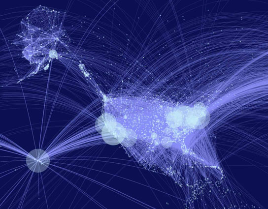
Flow maps are developed in cartography to show linear movement from one location to another with the width of the flow line increasing or decreasing depending on quantity. The flow map above shows the flight routs from the 40 largest U.S. airports. This type of map can be extremely helpful in determining links to how things spread, such as disease, and determining the place of origin.
http://visuanalyze.wordpress.com/
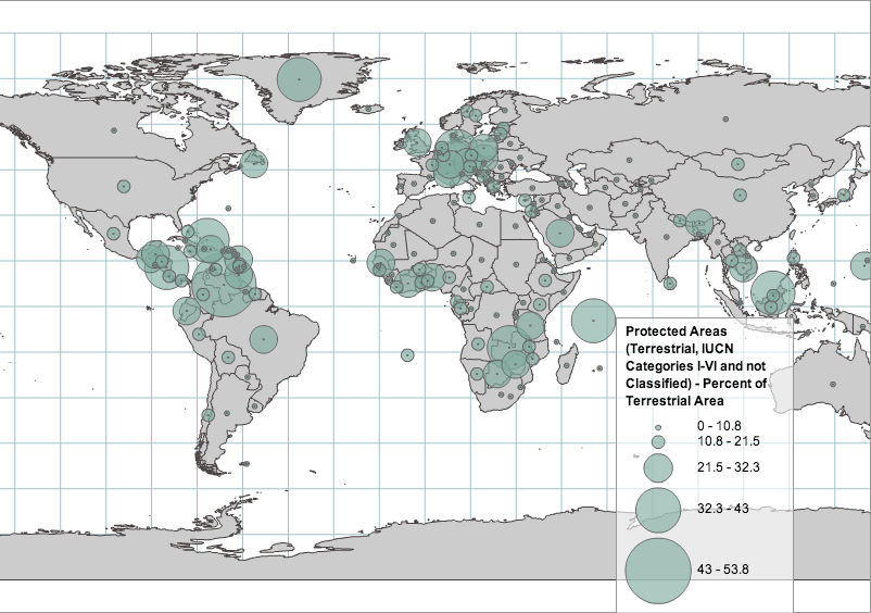
A proportional circle map is a type of point pattern map. In a proportional circle map the size of the circle or symbol is dependent directly upon the measured variable. There are two different types of proportional circle maps, range graded and continuously variable. Range graded proportional circle maps have a set of circles listed in the legend and the data must fit into one of the circles used in the legend. The map above shows the percent of protected terrestrial areas around the world. These areas range from 0% protected - 53.8% protected. Every protected area in this map falls into one of the proportional circles categories, they do not vary in size from those that are used in the legend.
http://www.nrcs.usda.gov/wps/portal/nrcs/detail/national/technical/nra/nri/?cid=stelprdb1083124
Dot density is a type of point pattern map that uses non-proportional points to show the density of the measured data. The dot density map above if showing the amount of rangeland there was throughout the United States in 2007. One dot on this map represents 25,000 acres of rangeland. As you can see the distribution of dots (acres of rangeland) is very dense in the western United States, but very sparse in the east. Dot density distribution maps can be very beneficial when trying to determine the density of a specific type of place, object, or species.